library(tidyverse)Week 5: Annotations
This is the fifth of a series of posts on how to use ggplot2 to visualise data in R.
We begin by loading the tidyverse package which contains ggplot2 alongside other useful packages. If you haven’t yet, you first need to install the tidyverse package by running install.packages("tidyverse").
This week’s dataset comes from a study by Cuddy et al. (2009). Students from seven EU nations (Belgium, France, Germany, the Netherlands, Portugal, Spain, and the UK) rated how competent and warm they thought each of fifteen EU nations (including their own) was perceived by other EU citizens.
dl <- read_rds("https://github.com/nilsreimer/data-visualisation-workshop/raw/master/materials/gwtp/dl_wk5.rds")
print(dl, n = 5)
# A tibble: 22 × 4
country rater competence warmth
<chr> <chr> <dbl> <dbl>
1 Austria other 0.369 0.219
2 Belgium other 0.378 0.418
3 Belgium same 0.505 0.0903
4 Denmark other 0.422 0.365
5 Finland other 0.351 0.327
# ℹ 17 more rowsThis dataset contains the aggregated competence and warmth ratings for each country. It contains two ratings for countries that were represented among respondents, one by raters from the same country (rater == "same") and one by raters from other countries (rater == "other").
In another post, we have already used geom_hline() to annotate a plot. We add geom_vline() to divide the plot into quadrants.
ggplot(dl, aes(x = competence, y = warmth)) +
  geom_hline(yintercept = 0.5, linetype = "dashed", colour = "grey20") +
  geom_vline(xintercept = 0.5, linetype = "dashed", colour = "grey20") +
  geom_point() +
  coord_fixed(1, xlim = c(0, 1), ylim = c(0, 1))
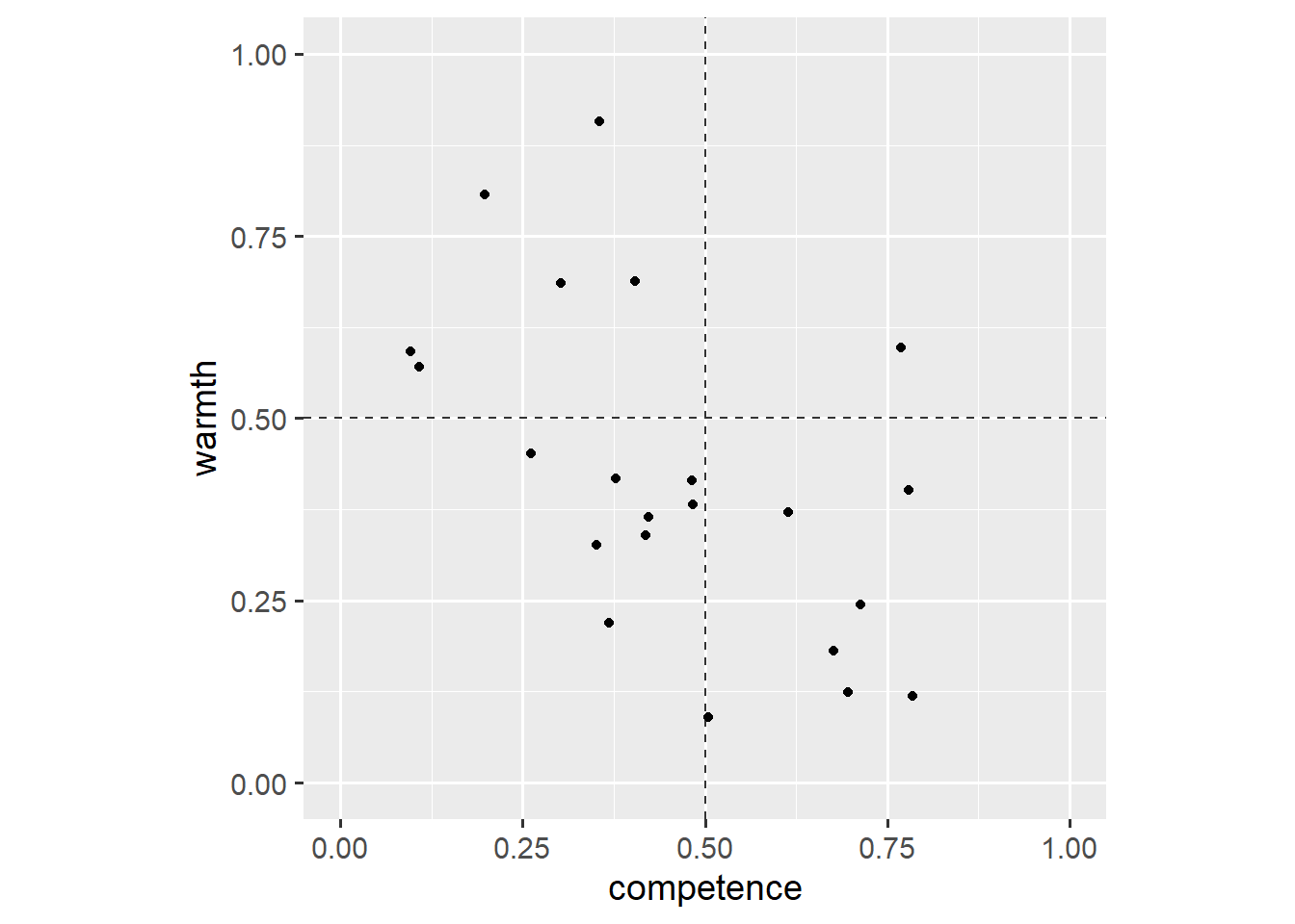
All of this should be familiar by now. If not, have a look at the other posts before reading on or use the help() function. This plot shows that respondents rated only one country as both competent and warm (upper-right quadrant).1
We use now-familiar commands to compare how ratings by the same group and other groups differ.
ggplot(dl, aes(x = competence, y = warmth)) +
  geom_hline(yintercept = 0.5, linetype = "dashed", colour = "grey20") +
  geom_vline(xintercept = 0.5, linetype = "dashed", colour = "grey20") +
  geom_line(aes(group = country)) +
  geom_point(aes(shape = rater)) +
  coord_fixed(1, xlim = c(0, 1), ylim = c(0, 1))
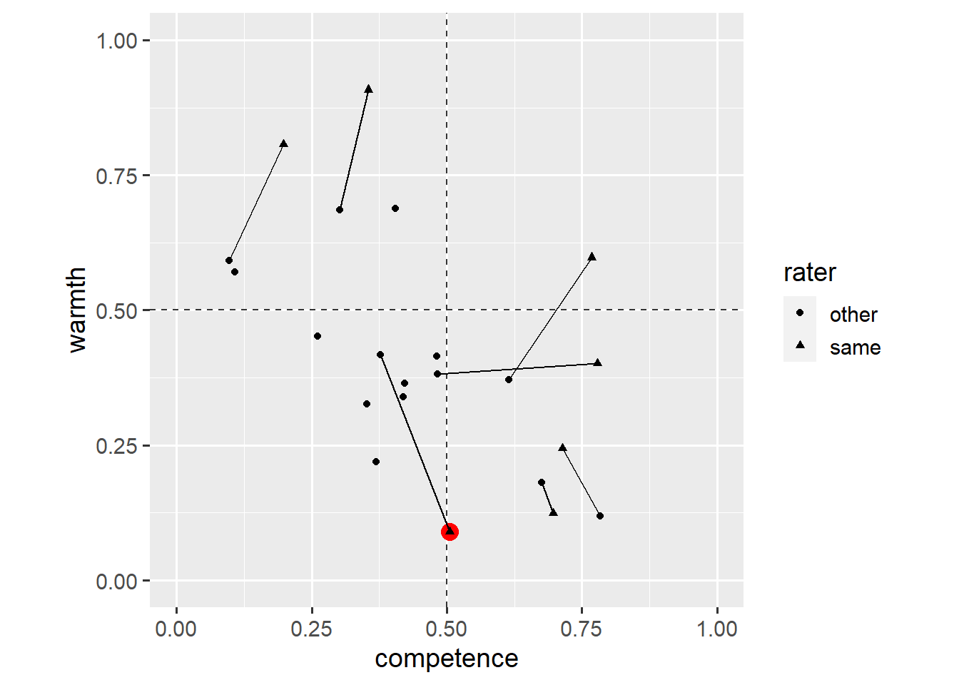
Overall, respondents tended to think that their own country was seen as warmer and more competent than respondents from other countries thought.
One striking exception is Belgium. Belgians seem to think that other EU citizens see Belgians as a lot less warm. This, however, is difficult to tell from the plot. We add an annotate() layer to highlight this data point.
ggplot(dl, aes(x = competence, y = warmth)) +
  geom_hline(yintercept = 0.5, linetype = "dashed", colour = "grey20") +
  geom_vline(xintercept = 0.5, linetype = "dashed", colour = "grey20") +
  annotate(
    geom = "point",
    x = 0.5048966268,
    y = 0.0903429925,
    size = 4,
    colour = "red"
  ) +
  geom_line(aes(group = country)) +
  geom_point(aes(shape = rater)) +
  coord_fixed(1, xlim = c(0, 1), ylim = c(0, 1))
The annotate() function does not inherit aesthetics (x, y) from the ggplot() function. It can take on the form of any other geom (in this case, geom = "point"). Note that we have placed the annotate() layer below the geom_point() layer.
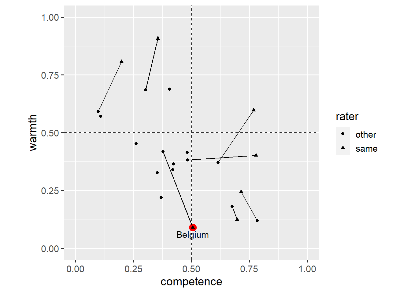
This plot highlights Belgians’ ratings of how they thought Belgians were seen by others. We could explain this in the plot’s caption, but it’d be easier for the reader if we included that information in the plot itself. We add another annotate() layer.
ggplot(dl, aes(x = competence, y = warmth)) +
  geom_hline(yintercept = 0.5, linetype = "dashed", colour = "grey20") +
  geom_vline(xintercept = 0.5, linetype = "dashed", colour = "grey20") +
  annotate(
    geom = "point",
    x = 0.5048966268,
    y = 0.0903429925,
    size = 4,
    colour = "red"
  ) +
  annotate(
    geom = "text",
    x = 0.5048966268,
    y = 0.0903429925,
    label = "Belgium",
    vjust = 1.5
  ) +
  geom_line(aes(group = country)) +
  geom_point(aes(shape = rater)) +
  coord_fixed(1, xlim = c(0, 1), ylim = c(0, 1))
This time, the annotate() layer creates a geom_text() layer. Note that geom_text() requires the label aesthetic in addition to the x and y aesthetics. The vjust aesthetic specifies the vertical justification of the text relative to its x-y coordinates (see here for details).
We might want to highlight another data point. We can use vectors, c(...), to annotate more than one point.
ggplot(dl, aes(x = competence, y = warmth)) +
  geom_hline(yintercept = 0.5, linetype = "dashed", colour = "grey20") +
  geom_vline(xintercept = 0.5, linetype = "dashed", colour = "grey20") +
  annotate(
    geom = "point",
    x = c(0.5048966268, 0.6964091404),
    y = c(0.0903429925, 0.1242246627),
    size = 4,
    colour = "red"
  ) +
  annotate(
    geom = "text",
    x = c(0.5048966268, 0.6964091404),
    y = c(0.0903429925, 0.1242246627),
    label = c("Belgium", "UK"),
    vjust = 1.5
  ) +
  geom_line(aes(group = country)) +
  geom_point(aes(shape = rater)) +
  coord_fixed(1, xlim = c(0, 1), ylim = c(0, 1))
This plot shows that ratings by the same group and other groups are a lot closer for the UK than for Belgium. Still, this method gets cumbersome when we want to annotate more than two data points. Instead, we could add a layer based on another dataset.
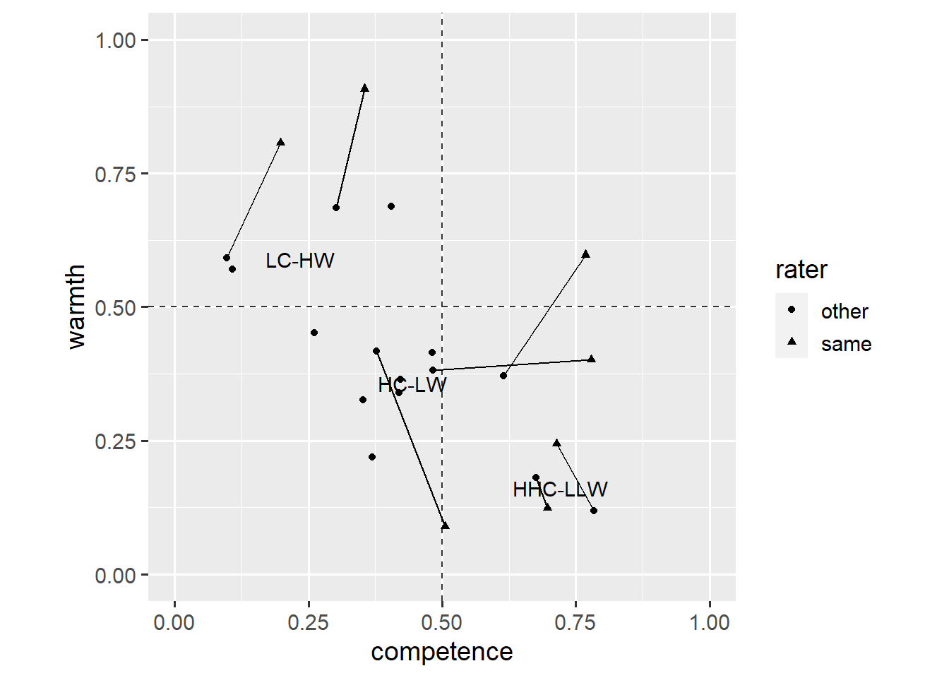
For example, Cuddy et al. (2009) divided countries into three clusters: countries seen as low in competence and high in warmth (LC-HW), countries seen as high in competence and low in warmth (HC-LW), and countries seen as very high in competence and very low in warmth (HHC-LLW).
dc <- read_rds("https://github.com/nilsreimer/data-visualisation-workshop/raw/master/materials/gwtp/dc_wk5.rds")
print(dc)
# A tibble: 3 × 3
competence warmth cluster
<dbl> <dbl> <chr>
1 0.235 0.589 LC-HW
2 0.444 0.356 HC-LW
3 0.721 0.161 HHC-LLWThis dataset defines the centre of each cluster. We can use the data argument to add a geom_text() layer that uses the new dataset to position the cluster labels at the centre of each cluster.
ggplot(dl, aes(x = competence, y = warmth)) +
  geom_hline(yintercept = 0.5, linetype = "dashed", colour = "grey20") +
  geom_vline(xintercept = 0.5, linetype = "dashed", colour = "grey20") +
  geom_line(aes(group = country)) +
  geom_point(aes(shape = rater)) +
  geom_text(data = dc, aes(label = cluster)) +
  coord_fixed(1, xlim = c(0, 1), ylim = c(0, 1))
Instead, we can use a geom_label() layer which makes the text easier to read.
ggplot(dl, aes(x = competence, y = warmth)) +
  geom_hline(yintercept = 0.5, linetype = "dashed", colour = "grey20") +
  geom_vline(xintercept = 0.5, linetype = "dashed", colour = "grey20") +
  geom_line(aes(group = country)) +
  geom_point(aes(shape = rater)) +
  geom_label(data = dc, aes(label = cluster), alpha = 0.5) +
  coord_fixed(1, xlim = c(0, 1), ylim = c(0, 1))
Note that we have placed the geom_label() layer above the geom_point() layer, but have also made the labels’ background semi-transparent (alpha = 0.5). This plot shows that ratings by the same group and other groups are most similar for countries perceived as very competent.
Still, this plot would be more informative if every data point was labelled. We again use a geom_text() layer.
ggplot(dl, aes(x = competence, y = warmth)) +
  geom_point(aes(shape = rater)) +
  geom_text(aes(label = country)) +
  coord_fixed(1, xlim = c(0, 1), ylim = c(0, 1))
This plot is difficult to read as points and labels overlap. One way to go from here would be to remove the points and rely on labels alone. This, however, would make it difficult to infer the exact ratings for a country.
Instead, we load an extension for ggplot2 that allows adding labels that repel one another and are repelled by the data points. If you haven’t yet, you need to install the ggrepel package by running install.packages("ggrepel").
library(ggrepel)The geom_text_repel() layer requires the same aesthetics as a geom_text() layer.
ggplot(dl, aes(x = competence, y = warmth)) +
  geom_point(aes(shape = rater)) +
  geom_text_repel(aes(label = country)) +
  coord_fixed(1, xlim = c(0, 1), ylim = c(0, 1))
This plot looks a lot better, though we might want to make clearer which ratings are by the same group and by other groups.
ggplot(dl, aes(x = competence, y = warmth, colour = rater)) +
  geom_point(aes(shape = rater)) +
  geom_text_repel(aes(label = country)) +
  scale_colour_grey(start = 0.0, end = 0.5) +
  coord_fixed(1, xlim = c(0, 1), ylim = c(0, 1))
This plot shows that, for ratings of other EU nations, competence and warmth seem to be negatively correlated. We might also want to add an annotate() layer to highlight the difference in ratings of Belgium.
ggplot(dl, aes(x = competence, y = warmth, colour = rater)) +
  annotate(
    geom = "segment",
    x = 0.3775843308,
    y = 0.4178957764,
    xend = 0.5048966268,
    yend = 0.0903429925,
    colour = "red",
    arrow = arrow(length = unit(0.2, "cm"), type = "closed")
  ) +
  geom_point(aes(shape = rater)) +
  geom_text_repel(aes(label = country)) +
  scale_colour_grey(start = 0.0, end = 0.5) +
  coord_fixed(1, xlim = c(0, 1), ylim = c(0, 1))
And that’s it for this post. You now know how to use annotations and labels to create more informative figures. If you have a question or found a mistake, please comment on Twitter or send me an email.
Next week, we’ll tackle the important issue of how to visualise results from statistical models in ggplot2.
Footnotes
It’s French people rating how they think French people are seen by other EU nations.↩︎